The Matching-Parts Myth in Collaborative Work
The matching-parts myth in collaborative work can flatten a shared project. Use deliberate placement and recurring visual cues to connect varied contributions without erasing them.
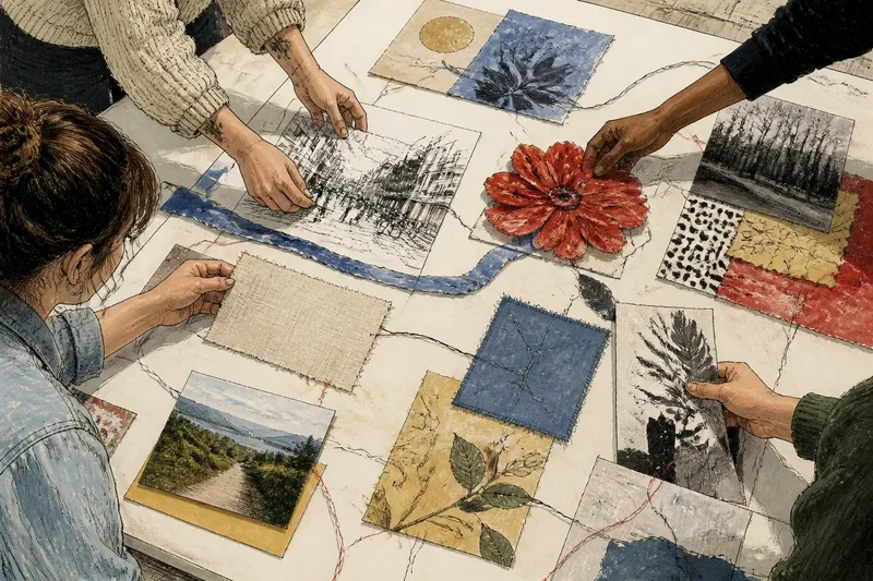
The matching-parts myth in collaborative work turns a shared project into a test of uniformity. A group can make one coherent piece without making every contribution look alike; the useful question is how the parts relate once they meet. That distinction matters when a collage, community banner, or shared sculpture begins to feel either scattered or suspiciously alike.
A project can have a clear subject and still lack visual rhythm. The trouble often appears in the arrangement: a cluster of dense marks beside a broad blank area, or a small, quiet piece stranded between louder ones. Rather than asking contributors to imitate one another, look at what the assembled work lets the eye notice.
Give the composition a visual rhythm
Rhythm comes from recurrence and change. A curved line can appear in several places without being drawn in the same hand; a sequence of dense and open areas can give the viewer somewhere to pause. The recurring element need not be a motif. It can be a direction, a repeated material edge, or a gradual shift in visual weight.
Put the pieces on a table or floor before attaching anything. Step back and look for clusters, gaps, and abrupt changes in scale. Try a different order before deciding that a contribution needs alteration. A new neighbor can make an isolated shape feel connected.
Make a rough arrangement before reaching for glue.
Use materials as bridges without making them uniform
Different materials carry different visual textures. Glossy photographs, torn paper, fabric, and pencil marks can coexist if the composition gives the eye a way to move between them. A narrow strip of colored paper, for instance, can cross a seam between two materials without covering either contribution.
Other bridges are less literal. Place a rough-edged piece beside another rough edge, repeat a color in a distant corner, or let a line continue across a gap. These connections do not need to be added by every contributor; a group can make them during assembly while keeping the original marks intact.
Try a bridge that links two parts, not a finish that covers them all.
Use placement to make contrast feel intentional
Contrast can give a shared work energy, but an accidental pile-up of contrasts can make it hard to read. A bright panel beside a busy photograph may demand more attention than either deserves. Moving one of them, or placing a quieter piece between them, can restore balance without changing their appearance.
Imagine a group laying out a community banner with a red paper flower, a black-and-white street drawing, and a pale fabric square. They place the flower beside the drawing, then move the fabric square between them. The color now echoes across the composition while the flower and drawing remain distinct; the visible result is a less abrupt transition, not a matched style.
Change the neighbors before changing the pieces.
How can varied contributions read as one work?
Can a shared palette connect different styles?
It can, if the palette appears as a recurring cue rather than a rule every contributor must follow. A few repeated colors may help the eye travel across the work while leaving each person’s technique distinct.
Should every piece use the same material?
No. A common material can make assembly easier, but varied textures can also create useful contrast. The decision depends on whether the materials sit together cleanly and support the composition the group wants.
What should happen when one area feels crowded?
Move the pieces around it and test a quieter gap before removing material. If the area still feels crowded, ask the contributor whether a small adjustment is welcome rather than treating the piece as a problem to fix unilaterally.
How can a group judge the arrangement?
Look at the whole from the distance at which people are likely to encounter it, then come closer to check details. If the eye gets stuck, try changing order, spacing, or orientation before adding another connecting mark.
Let relationships carry the unity
A coherent collaborative work does not need one style. Its unity can come from the way shapes echo, materials meet, and visual emphasis moves across the surface. The useful question is not whether every part matches, but whether each part has a legible relationship to its neighbors.
For the matching-parts myth in collaborative work, the practical correction is modest: arrange first, notice what connects, and use the lightest touch that makes those connections visible. A little empty space is often doing more work than another layer of paint.